Can Your Government RFP Still Look Good?
Government solicitations often fix your fonts, margins and page limits — but rarely everything. Colour, tables, charts, headers, captions and white space usually remain yours. Here is what is typically dictated, what you can still control, and when the right answer is to design nothing at all.
Government solicitations often fix your fonts, margins and page limits — but they rarely fix everything. Colour, table and chart styling, headers, captions and white space usually remain yours. The useful question is not whether a government proposal can look good, but exactly which levers this particular solicitation has left you.
What Is Usually Dictated, and What Is Usually Yours?
| Typically prescribed | Typically left to you |
|---|---|
| Font family and minimum size | Colour, within reason |
| Margins and line spacing | Table and chart styling |
| Page limits per section | Headers, footers and page numbering |
| Section order and numbering | Captions and figure labels |
| File format and naming | White space and visual rhythm |
| Cover page or form templates | Diagrams, org charts, process visuals |
Read the formatting section carefully before you design anything, because every item in the left column is compliance, and compliance is screened before your content is read. A handsome response that breaks a stated page limit is non-responsive, and no amount of design recovers from that.
What Can You Still Control?
- Colour, used sparingly. You may not be able to change the body font, but brand colour in table headers, chart series, section rules and callout boxes makes a document recognizably yours. A little goes a long way against a page of black text.
- Tables. Almost never restricted, and the highest-value tool available in a constrained document. A comparison, a compliance matrix or a staffing summary in a well-built table reads faster than any paragraph and costs less page space.
- White space. Counterintuitive when pages are limited, but a wall of unbroken text is genuinely harder to score. Spacing between sections and around headings costs little and buys real readability.
- Headers, footers and page numbering. Rarely prescribed and genuinely useful. Putting the section name and number in the header helps an evaluator flipping to requirement 4.3 land in the right place.
- Captions. A caption that states the point rather than naming the figure is free persuasion, and evaluators skim them.

How Much Design Is Too Much?
The test is whether each element does work. A chart that makes a comparison obvious, a diagram that shows a process, a coloured header that helps someone navigate — all earning their space. Decorative elements added to fill white space or to look modern are not, and in a page-limited response they are actively expensive because they displace content.
Restraint also reads as professionalism to this particular audience. Government evaluators are not looking to be impressed by production values; they are looking to confirm you can do the work and that you followed the instructions. Design that draws attention to itself can suggest the opposite.
One reliable place to spend a little effort is the elements every reader passes through — the cover page, the contact block, the section dividers. They are usually unrestricted, and they set the tone before any content is read.
Why Does Consistency Matter More Here?
Because when your formatting choices are few, the ones you make are conspicuous. Three different table styles or four heading treatments across a document stand out sharply in an otherwise uniform response, and they signal that several people assembled it separately — which is usually true and never helpful.
Decide the rules once and put them in a template before drafting starts — fonts per heading level, table style, caption format, colour values. Our guide to RFP layout covers the structural side, and a final proofreading pass catches whatever drifted.
When Should You Not Design At All?
When the solicitation mandates a response template or a form-driven format. Fill it in exactly as issued and change nothing — not the fonts, not the table structure, not the order of the fields. Evaluators are working from the standard layout, and a reformatted template is a compliance risk with no upside whatsoever.
In that situation your only lever is the words inside the boxes, and it is a good lever. Precision, directness and answering exactly what was asked matter more than anything visual. Where you do have latitude, which graphics earn their space covers how to spend it.
Check the Formatting Section Before You Start
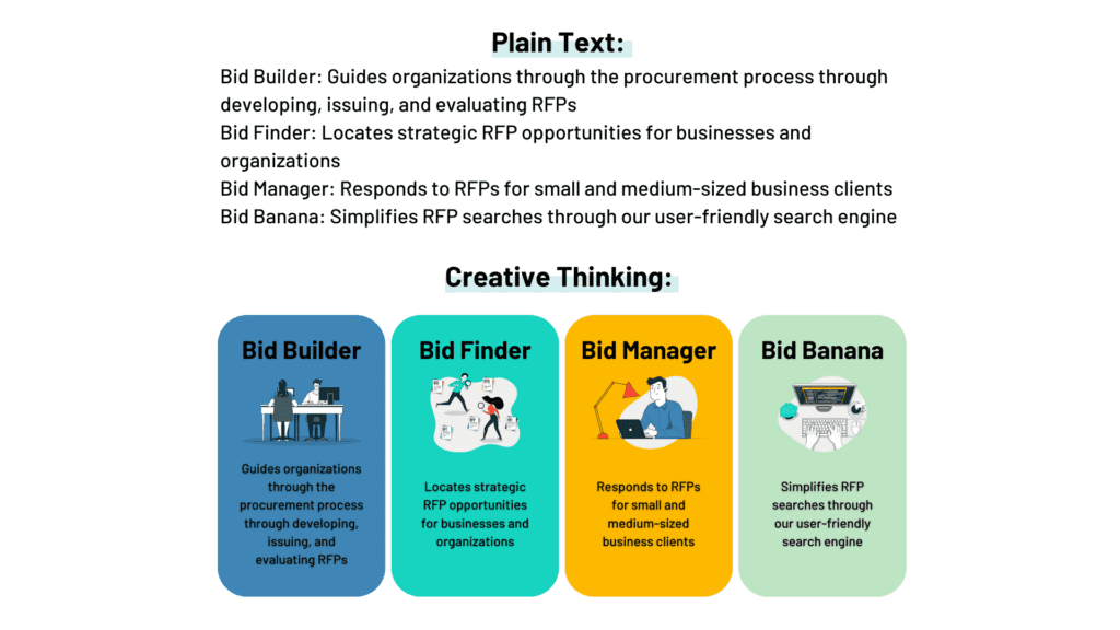
Every solicitation draws the line somewhere different, so the answer is always in the document rather than in general advice. Bid Banana consolidates federal, state and local opportunities into one search — open one in your industry and read its formatting requirements before planning anything.
The Bid Lab produces government proposals within these constraints daily. Schedule a free consultation, call 1-844-4BIDLAB, or email respond@thebidlab.com.
Frequently asked questions
Can you use design in a government proposal?▼
Usually yes, within limits. Solicitations commonly fix fonts, type size, margins and page counts, and sometimes mandate a response template. What they rarely dictate is colour, table and chart styling, header and footer treatment, captions, and how you use white space. Work out exactly what is prescribed before assuming a government response has to look plain.
What formatting do government RFPs usually dictate?▼
Most often font family and minimum size, margins, line spacing, page limits per section, file format and naming conventions, and required cover page or form templates. Some also restrict font sizes inside graphics, to prevent bidders shrinking text to evade page limits. All of it is compliance, which is screened before your content is evaluated.
Should you add your branding to a government proposal?▼
Where the solicitation permits it, yes — but subtly. Brand colour in table headers, chart series, rules and callouts makes a document recognizably yours without breaking prescribed body formatting. What does not work is treating a compliance-driven submission like a marketing brochure. If a mandated template governs the layout, use it exactly and put your identity in the content.
Does design actually affect government RFP scoring?▼
Indirectly. Design is almost never a scored criterion, but findability is what converts your content into points. A response where each requirement's answer is easy to locate, with tables that make comparisons obvious, gets scored on its merits. One where evaluators hunt loses points on criteria you genuinely met. That is the whole mechanism.
When should you not design a proposal at all?▼
When the solicitation mandates a response template or form-driven format, fill it in exactly as issued and change nothing. Reformatting a required template is a compliance risk with no upside, since evaluators are working from the standard layout. In that situation your only lever is the clarity and precision of the words inside the boxes.